


A DataFuseAI pipeline processed 60 million records from a multi-source global trade dataset and wrote the results to five pre-aggregated analytics tables. Power BI loaded the complete dashboard suite from those outputs in seconds. No timeout. No memory warning. No complex DAX measures required to do work that should never happen in a visualization layer.
Imagine that same data raw. Transaction records spanning six fiscal years — order lines, customer tiers, supplier ledgers, product categories, regional metadata — all sitting in normalized relational tables across PostgreSQL and MySQL databases. Now picture a data analyst opening Power BI, selecting Import mode, pointing it directly at the 60-million-row fact table, and waiting. The spinner runs. Memory climbs. The import either crawls to completion or fails. If it loads at all, every slicer interaction triggers fresh computation against an enormous unoptimized dataset.
This is the volume problem BI tools weren't designed to solve. Joining and aggregating tens of millions of raw rows before rendering a single chart is data engineering work — and when it's left to the visualization layer, everyone pays for it: slower dashboards, unreliable refresh cycles, analysts spending minutes per report interaction instead of seconds. The work belongs upstream. That's precisely what this pipeline demonstrates.
 Enlarge
 - Power BI's in-memory engine is optimized for pre-aggregated data. Feeding it raw millions-of-row fact tables is the wrong architecture — not a fixable performance issue.
- DataFuseAI processed 60 million TPC-H records into five purpose-built analytics tables in a single no-code pipeline run on a 2-core 16 GB Databricks cluster.
- The output PostgreSQL database connects to Power BI via the native connector — no middleware, no custom drivers, no additional transformation in Power BI required.
- Each analytics table was built for a specific dashboard use case. Core metrics arrive pre-computed, which means no heavy DAX aggregation at query time.
- The same architecture applies to any high-volume operational dataset: financial records, retail transactions, logistics data, healthcare encounters.
Why BI Tools Struggle at Scale
Power BI's VertiPaq in-memory engine is genuinely fast — for the right type of data. It compresses columnar datasets efficiently and enables rapid query response through in-memory processing. The limitation isn't the engine. It's what happens when raw, unnormalized, high-volume data is fed directly into it.
Microsoft documents a 1 GB dataset size limit for Power BI Pro workspaces operating in Import mode.[1] Premium capacity and large model support raise that ceiling considerably, but even within Premium, Microsoft's own guidance recommends building aggregation tables for large semantic models — pre-summarized layers that Power BI queries instead of scanning the full base fact table for every visual interaction.[2]
The alternative is DirectQuery, which avoids the import entirely by querying the source database on demand. That solves the size problem but trades it for a latency problem: every visual, every slicer interaction, every filter fires a query to the source database. A dashboard with five visuals and three active slicers generates multiple simultaneous queries against a 60-million-row table. Response times measured in seconds, not milliseconds. Dashboards that require deliberate patience to use.
Neither approach fixes the underlying problem. The underlying problem is that 60 million raw rows require engineering work — joins, filters, aggregations, derivations — before they become meaningful analytics. That work should happen once, in a data pipeline, rather than repeatedly at dashboard query time.
- Import fails or hits size limits on large fact tables
- DirectQuery adds per-visual query latency at scale
- Complex DAX measures do aggregation work at query time
- Dashboard refresh measured in minutes; slicer response slow
- BI analysts write and maintain heavy transformation logic
- Small, pre-aggregated tables import in seconds
- All joins, filters, and aggregations computed once in pipeline
- Core metrics arrive as pre-built columns — no heavy DAX needed
- Dashboard refresh and slicer response under five seconds
- BI analysts focus on visualization, not data transformation
What "Analytics-Ready" Actually Means
Analytics-ready data has already been shaped for the specific questions the dashboard needs to answer. Instead of raw transaction rows with foreign keys referencing normalized dimension tables, a BI tool receives pre-computed totals, counts, rankings, and ratios — organized by the exact dimensions used in filters and chart axes.
For the Global Trade Intelligence project, this meant transforming 60 million raw order line items across multiple source tables into five purpose-built analytics tables, each designed for a specific dashboard view:
- Monthly Revenue Trend — net revenue, gross revenue, and total discount aggregated by region, market segment, and year-month period
- Geographic Nation Summary — revenue totals, order counts, and market segment composition by country and world region
- Product Type KPI — revenue and volume by product type, segmented by region for product performance analysis
- Customer Tier Intelligence — customers classified into Platinum, Gold, Silver, and Bronze tiers with count, revenue, and discount metrics per tier
- Supplier Metrics — supplier health scores, account balance ranges, and revenue contribution by nation and region
The scale reduction is the proof. The monthly revenue trend output shows 2,000 aggregated rows — the complete analytical summary of monthly revenue patterns across all regions, segments, and years in the dataset. Those 2,000 rows came from 60 million source records. Power BI imports 2,000 rows instantly. It does not import 60 million rows instantly.
The core shift: Analytics-ready data moves computation upstream. The expensive work — joining normalized tables, applying filters, computing aggregations — happens once at DataFuseAI pipeline runtime. Power BI receives pre-computed answers, not raw data requiring further engineering. Every dashboard interaction becomes a read operation against a small, indexed table, not a recomputation from scratch.
This matters for Tableau, Looker, and any other BI tool in the same way. The principle is tool-agnostic: pre-aggregate upstream, visualize downstream. The BI layer gets to do what it's designed for.
The Pipeline: One Workflow, 60 Million Records
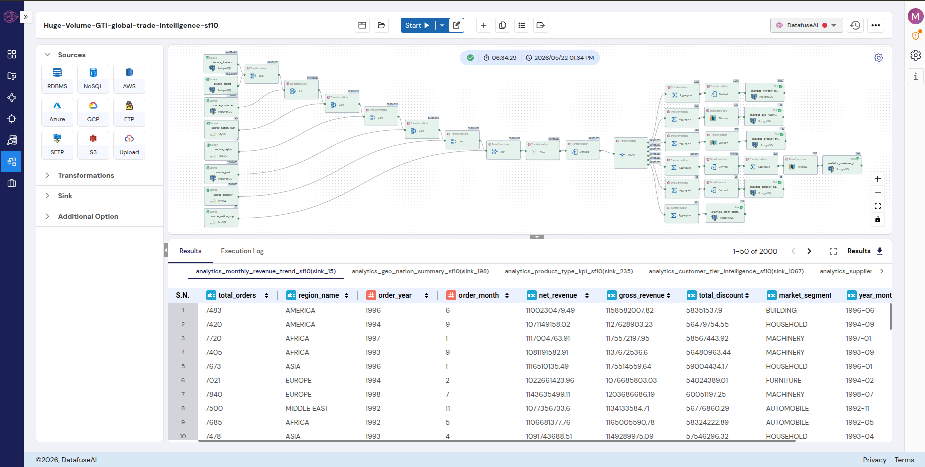
The pipeline that produced this output processes the TPC-H scale factor 10 dataset: roughly 60 million line item records, alongside orders, customers, suppliers, parts, and regional data tables spread across multiple source databases. Building it required no code.
 Enlarge
 DataFuseAI's drag-and-drop pipeline builder lets you pull source connectors onto a canvas, connect transformation nodes visually, and wire outputs to destination sinks. The entire pipeline topology — visible in the screenshot — mirrors the underlying data flow directly. What you see on the canvas is what executes.
Sources span multiple PostgreSQL and MySQL tables: orders, line items, customers, suppliers, parts, regions, and nations — the full TPC-H relational schema. From those sources, the pipeline fans through a sequence of Join, Aggregate, Filter, Derived column, and Window function transformations before writing to five PostgreSQL sinks in the analytics output database. Each sink node shows the output row count — a visual confirmation that data moved correctly at every stage.
DataFuseAI's pipeline monitoring tracks the last five execution cycles for any job, with 10-second system metrics and email alerts on failure. The green status indicator on the canvas confirms successful completion across all five output tables.
On compute flexibility: DataFuseAI is not locked to Databricks. The same pipeline runs on Apache Livy or DataFuseAI's native compute engine — the choice stays with the team based on existing infrastructure. No vendor lock-in on the compute side.
Connecting Power BI to the Output
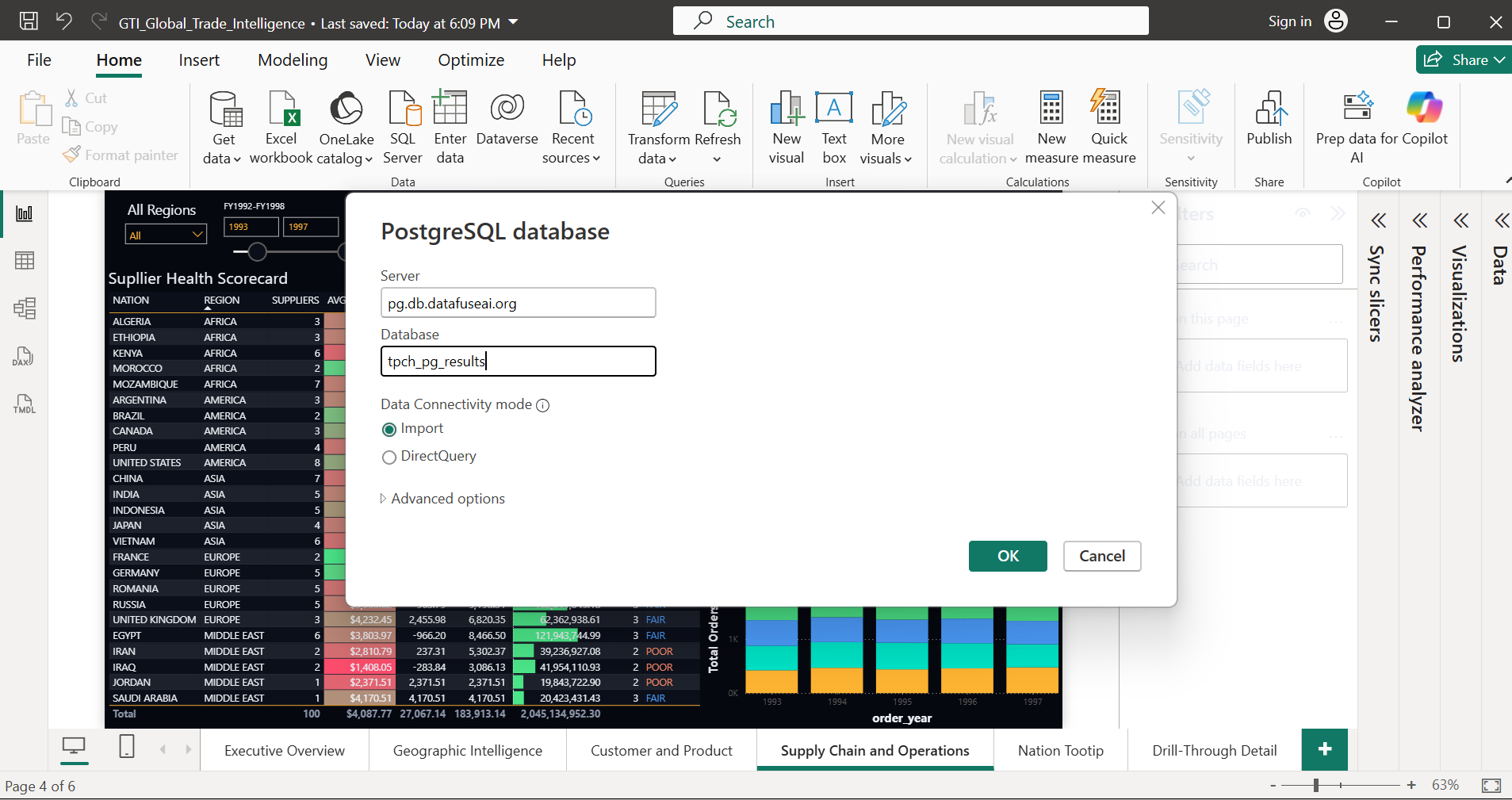
Once the pipeline completes, all five analytics tables live in a PostgreSQL database. Connecting Power BI is a standard Get Data operation — no custom configuration, no API setup, no intermediate layer.
 Enlarge
 In Power BI Desktop, the path is: Home → Get Data → PostgreSQL database. Enter the server and database details, select Import as the connectivity mode, and authenticate. Power BI presents the available tables. Select the five analytics output tables, click Load, and the data model is ready.
No transformation in Power Query is required — the columns arrive named, typed, and pre-computed. No relationships need to be defined between fact and dimension tables because each analytics table already embeds the dimension values it uses as plain columns: region_name, order_year, market_segment, customer_tier. The schema was designed from the DataFuseAI side to make Power BI consumption frictionless.
Import mode is the right choice here. The analytics output tables are small — 2,000 rows for the monthly trend table is a representative example. They load in seconds and enable the fastest possible dashboard interaction. DirectQuery latency, which compounds heavily at raw source scale, is irrelevant when the data arrives already aggregated.
Dragging Data Into Dashboards
With the analytics tables in the data model, building visuals follows standard Power BI workflow. No DAX expertise is required for core metrics — the measures are already computed columns in the analytics tables.
 Enlarge
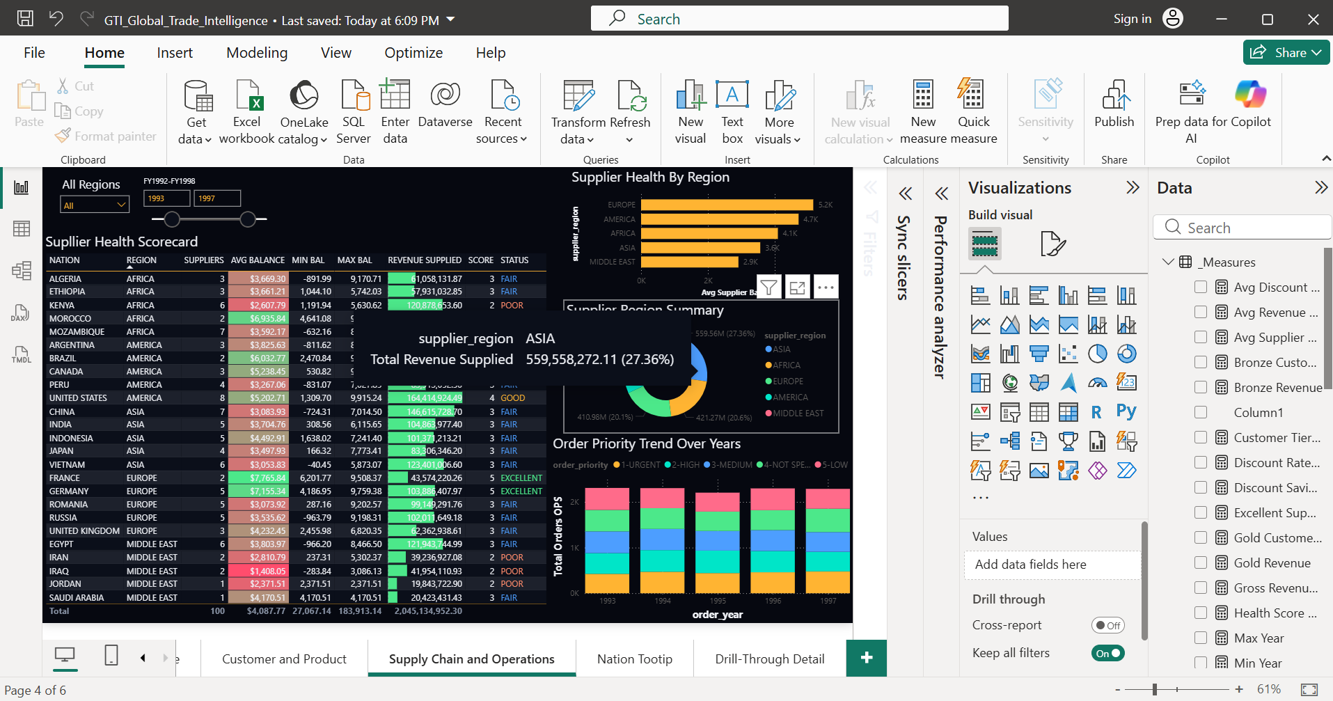
 Select a visual type from the Visualizations panel. Drag data fields from the Data panel into the Values, Axis, and Legend wells. For the supplier scorecard table, that means dragging nation_name, supplier_region, avg_balance, revenue_supplied, and health_score into the appropriate wells. The table renders immediately, with conditional formatting applied to the score and balance columns to create the color-coded health indicators visible in the final dashboard.
Slicers for Region, Market Segment, Customer Tier, and Year Range all connect to the same analytics field names shared across tables. Cross-filtering between visuals on the same page works without additional configuration — Power BI handles it automatically because the dimension columns match. Selecting a region in one chart filters all other visuals on the page to that region. No model relationships to build, no DAX filter context to manage.
"The aggregation was handled in DataFuseAI. Power BI reads pre-computed answers — it doesn't compute them."
The complete dashboard suite — four pages, multiple visual types, regional and temporal filters — was assembled in a single session after the pipeline completed. That's what analytics-ready data enables: BI work that's actually BI work, not data engineering repeated inside a visualization tool.
The Dashboard Suite: What the Data Revealed
Four dashboard pages cover distinct analytical perspectives on the Global Trade Intelligence dataset. Each was built from one or more of the five DataFuseAI analytics output tables, and each serves a different audience with a different set of questions.
Executive Overview
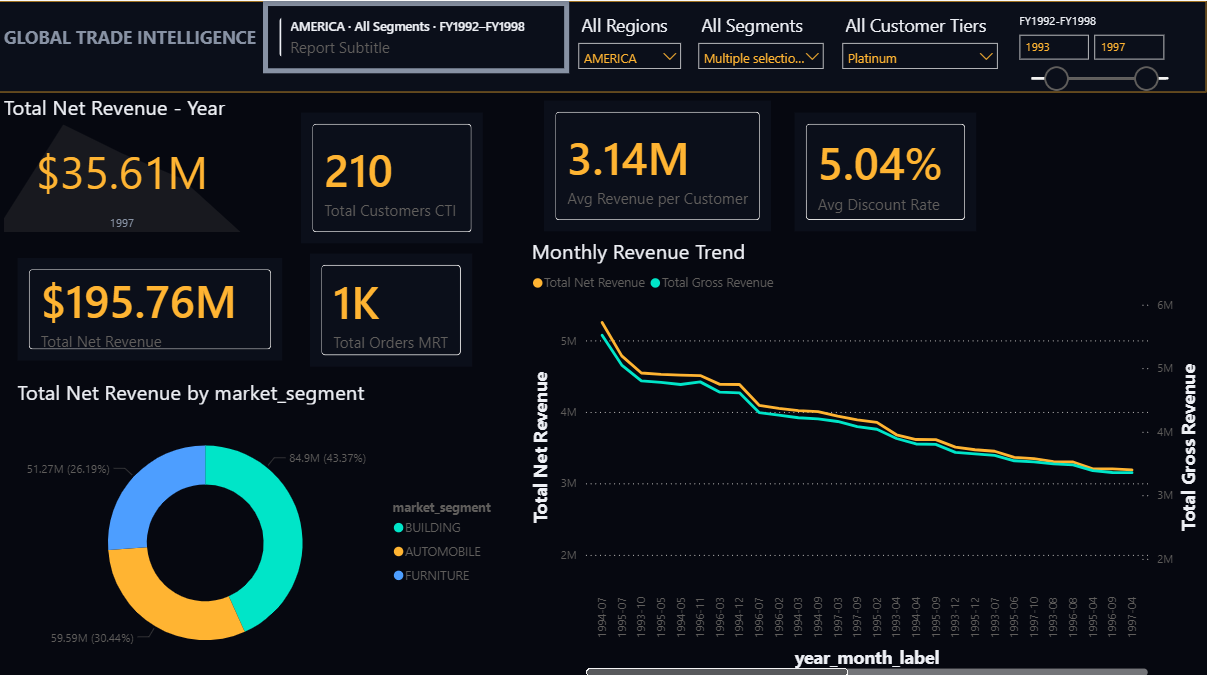
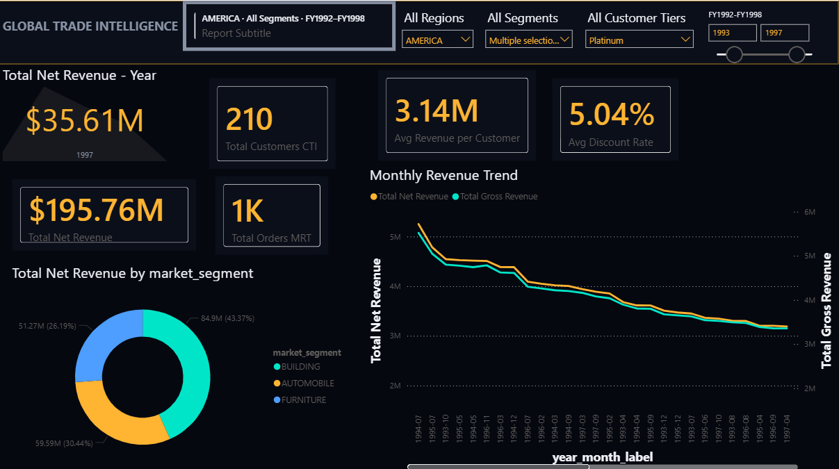
Executive OverviewThe executive dashboard gives leadership a configurable top-line view. Four slicers — Region, Market Segment, Customer Tier, and a fiscal year range slider — let any combination be examined without analyst involvement. Every visual on the page updates simultaneously when a filter changes.
 Enlarge
 Filtered to AMERICA and Platinum-tier customers: $195.76M in total net revenue across the period, $35.61M in fiscal year 1997 alone, 210 customers, and approximately 1,000 total orders. The Monthly Revenue Trend line chart plots net revenue and gross revenue across every month from 1994 to 1997, making seasonal movement and year-over-year patterns visible in a single view. The market segment donut shows Building at 43.37%, Furniture at 30.44%, and Automobile at 26.19% for this cohort.
A conversation that previously required a data analyst to run a custom SQL query or build a pivot table now takes 30 seconds with a slicer selection. Any combination of region, segment, tier, and year resolves in under two seconds — because the underlying monthly trend data is already aggregated to this granularity.
Geographic Intelligence
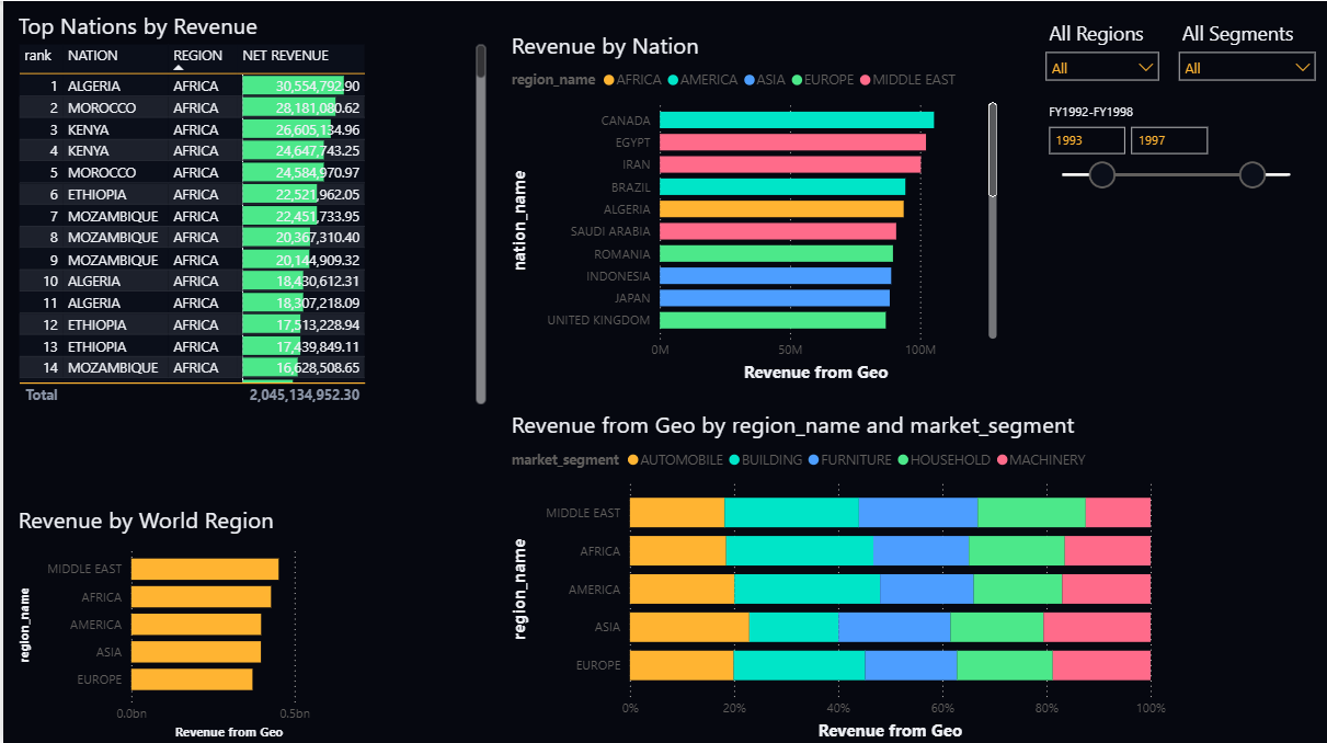
Geographic IntelligenceThe geographic page answers where revenue originates and how it distributes across market segments within each region. Four visuals work together: a ranked nation table, a world region bar chart, a nation-level horizontal bar, and a stacked proportional bar showing segment composition per region.
 Enlarge
 Algeria, Morocco, and Kenya lead the Top Nations by Revenue table in the Africa region. The Revenue by World Region chart shows absolute totals across all five regions without requiring any filter selection — it defaults to the full dataset. The stacked proportional bar in the lower right shows how Automobile, Building, Furniture, Household, and Machinery segment revenue distributes within each region, revealing that each world region carries its own distinct segment mix.
Commercial teams managing relationships across geographies answer two questions from one screen: which markets underperform on revenue, and which segments drive performance in each region. The year-range and region slicers let the same view serve both strategic quarterly reviews and tactical territory planning.
Customer and Product Intelligence
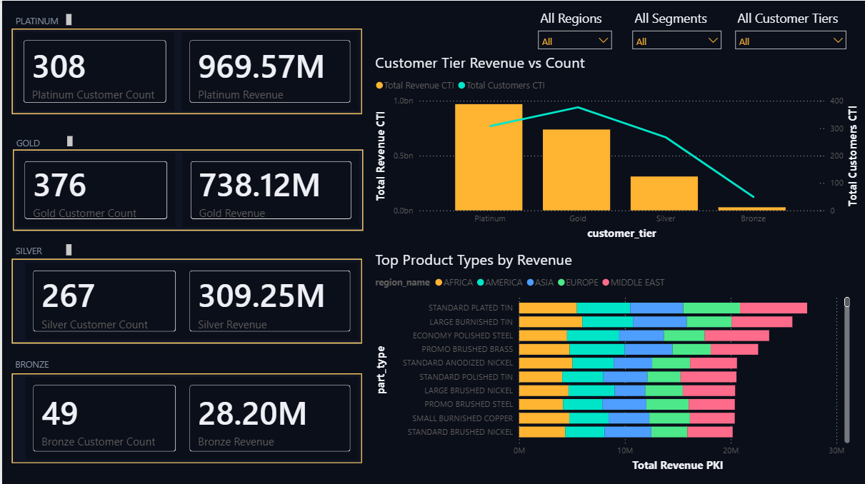
Customer & ProductCustomer segmentation is immediately visible on this page. Four tier panels display count and revenue simultaneously, and the dual-axis chart makes the revenue-per-customer ratio concrete across tiers.
 Enlarge
 Platinum: 308 customers, $969.57M. Gold: 376 customers, $738.12M. Silver: 267 customers, $309.25M. Bronze: 49 customers, $28.20M. The dual-axis Customer Tier Revenue vs Count chart makes the concentration pattern visible: Platinum generates the highest total revenue from fewer customers than the Gold tier. The Top Product Types by Revenue chart at the lower right, segmented by region name, shows Standard Plated Tin and Large Burnished Tin leading — with Asia and Africa contributing the most volume across top products.
Product and account teams answer two questions simultaneously: which customer tier drives the most revenue per customer, and which products are those customers buying by region. These are direct inputs for account expansion strategy, product focus, and territory-specific promotions — all from a single pre-aggregated analytics table requiring no analyst build time.
Supply Chain and Operations
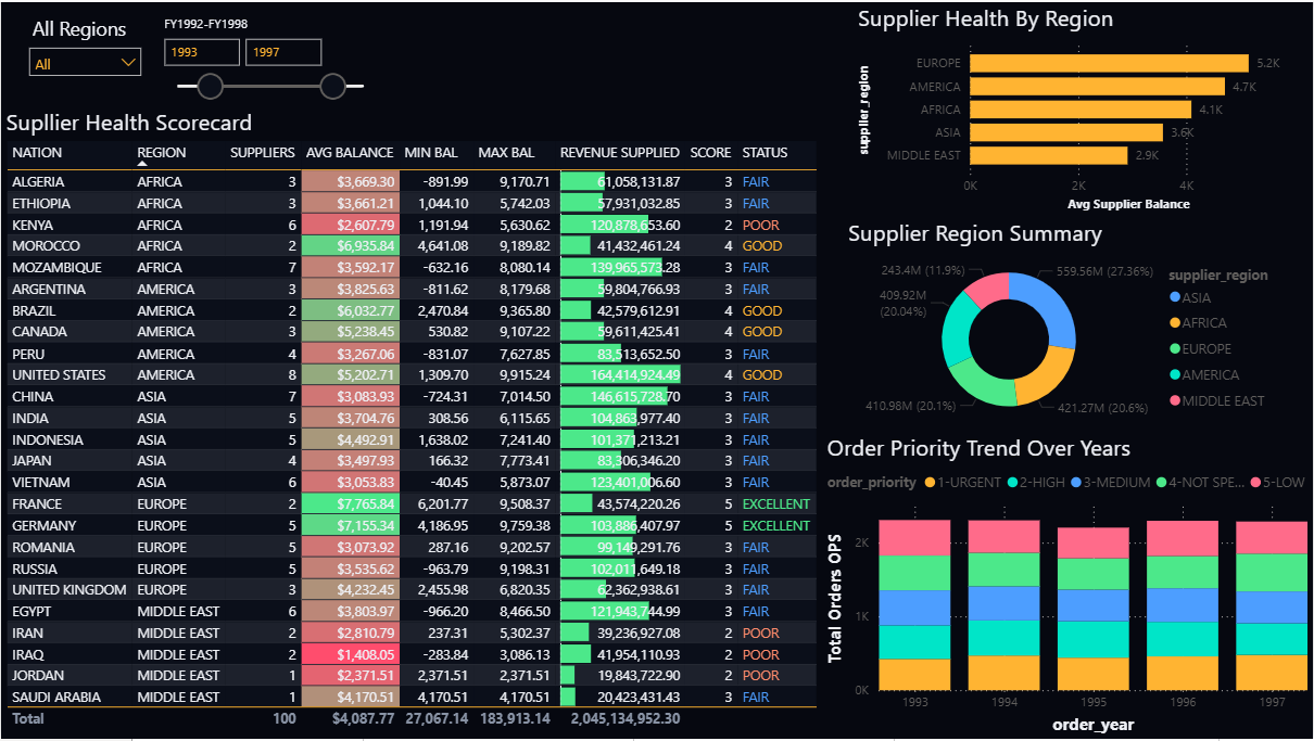
Supply Chain & OperationsThe most data-dense page in the suite. The Supplier Health Scorecard lists 25 nations and 100 suppliers with average account balance, balance range, revenue supplied, a composite health score from 1 to 5, and a plain-language status rating.
 Enlarge
 France and Germany rate EXCELLENT; the United States, Canada, Brazil, and Morocco rate GOOD; most nations rate FAIR; several Middle Eastern nations and Kenya rate POOR. The Supplier Health by Region bar chart shows Europe leading on average supplier balance at 5.2K, followed by America at 4.7K, Africa at 4.1K, Asia at 3.6K, and Middle East at 2.9K. The Supplier Region Summary donut shows Asia contributing 27.36% of total revenue supplied — the largest single region.
The Order Priority Trend stacked bar at the lower right tracks total orders by priority class — URGENT, HIGH, MEDIUM, NOT SPECIFIED, LOW — from 1993 to 1997. Priority distribution is relatively stable year over year: no significant shift toward urgent orders suggests stable supply-demand alignment across the period.
Supply chain and procurement teams replace separate Excel models per region — each updated manually from database extracts — with one page that refreshes on every pipeline run. Supplier risk is visible by nation. Regional concentration is quantified. Order priority patterns are tracked over years. Every number traces back to 60 million source records no analyst could process manually.
What This Proves About BI at Scale
The numbers from this project say something concrete. 60 million raw records. Five analytics tables. Four Power BI dashboard pages. Real business answers — for executive leadership, geographic teams, product and account managers, and supply chain operations — all from a single pipeline run on infrastructure that requires no specialized data warehouse, no separate aggregation layer configured inside Power BI, and no code written by hand.
The DataFuseAI pipeline ran on a 2-core 16 GB Databricks cluster. Not a high-end compute configuration. The architecture did the work — not the hardware. A peak throughput of 64,439 rows per second across a multi-join, multi-branch topology is what purpose-built pipeline infrastructure produces when the job is set up correctly.
What makes this pattern replicable is not the TPC-H dataset. Any high-volume operational data follows the same logic: retail transaction histories, multi-year financial ledgers, logistics event streams, healthcare encounter records. The volume varies. The principle doesn't. A data operations platform prepares data for consumption. The transformation and aggregation work happens once, at pipeline runtime, at the speed of a dedicated compute engine. The BI tool gets pre-computed answers it can render in milliseconds.
Power BI didn't struggle here. Tableau wouldn't have struggled either. Looker, or any other visualization tool that connects to a database, gets the same benefit. The dashboard layer does what it's designed for: render, filter, communicate. The data engineering work stays where it produces the most value — upstream, in a pipeline that runs on a schedule and keeps every dashboard current without analyst intervention.
Process first. Visualize after. That's the sequence that produces dashboards which actually load.
Frequently Asked Questions
In Import mode, Power BI Pro has a 1 GB dataset size limit. Even with Premium's large model support, loading tens of millions of raw un-aggregated rows creates slow refresh cycles and requires complex DAX measures to perform aggregation work that belongs upstream.[1] The correct architecture feeds Power BI pre-aggregated tables — small, indexed, purpose-built for the dashboard's specific questions. The GTI project reduced 60 million source rows to 2,000 aggregated rows for the monthly trend table alone. That's what Power BI imports in seconds.
Analytics-ready data has been joined, filtered, and aggregated before it reaches Power BI. Instead of raw transaction rows referencing normalized dimension tables, the BI tool receives pre-computed totals, counts, and rankings organized by the dimensions used in dashboards — region, time period, product type, customer tier. Power BI reads these as flat tables and renders visuals without any additional computation at query time. The joins and aggregations happened once, in the DataFuseAI pipeline, at pipeline runtime.
DataFuseAI writes pipeline output to databases or cloud storage that Power BI connects to natively. In the GTI project, output was written to a PostgreSQL database. Power BI imported the analytics tables using the built-in PostgreSQL connector — standard Get Data workflow, no custom drivers or middleware. The same approach works with any database that DataFuseAI supports as an output sink, depending on your infrastructure.
DataFuseAI connects to 50+ source types including 25 RDBMS variants, NoSQL databases (MongoDB, Cassandra, Couchbase, BigQuery, Azure Cosmos variants), object storage (S3), file formats (CSV, Excel, JSON), and FTP/SFTP. For cloud databases specifically, it supports 6 Azure variants and 8 RDS variants. The GTI pipeline draws from both PostgreSQL and MySQL sources simultaneously — joining data across database types is handled natively in the pipeline builder, without custom code.


 Request a Demo