


Six Tableau dashboards loaded in under two seconds from a single PostgreSQL database containing 3,535 pre-aggregated rows — output from a DataFuseAI pipeline that processed 60 million records. No mark count warnings. No FIXED LOD expressions required for basic percentage calculations. No filter interactions firing full-table scans against a 60-million-row fact table.
The alternative has a shape most Tableau practitioners know. Connect directly to the lineitem table: 60 million rows, seven fiscal years of trade transactions. Drag order_date, region_name, and net_revenue to the shelves. Tableau sends a VizQL query to the database — and that query has to scan every row to produce the 2,100 aggregated values the chart needs. On a Live connection, that scan repeats on every filter change. On an Extract, 60 million rows materialize into a .hyper file; the scan cost shifts, but it doesn't disappear.
VizQL is a query language, not a batch aggregation engine. The compression work — joining, filtering, and aggregating 60 million transaction rows down to thousands of analytical rows — belongs in the pipeline. This project demonstrates exactly that separation, using a DataFuseAI pipeline on the TPC-H global trade dataset.
 Enlarge
 - Tableau's performance bottleneck on large datasets is VizQL query time and mark count — not memory limits. Pre-aggregated tables solve it by delivering results at the exact grain each visualization type needs, eliminating database-side aggregation at query time.
- DataFuseAI processed 60 million TPC-H records into 6 analytics tables totalling 3,535 rows — each table built at the grain Tableau's mark model requires, on a 2-core 16 GB Databricks cluster.
- A Live connection to 3,535 pre-aggregated rows performs comparably to an Extract at this scale, while keeping dashboards current with every pipeline run without a separate refresh schedule.
- Pre-aggregated output removes the need for complex FIXED LOD expressions on basic percentage denominators — the calculation class that creates the most debugging effort in standard Tableau workflows against raw multi-table data.
- Three calculated fields cover the full authoring requirement: MAKEDATE for date axis construction, a CASE sort expression for customer tier, and one FIXED LOD to correct a specific data characteristic in the source column. Everything else arrives pre-computed.
Why Tableau Slows on Raw Data
Tableau's performance bottleneck on large datasets isn't memory. That's Power BI's architecture — VertiPaq, Import mode, dataset size constraints. Tableau's bottleneck is query time and mark count, and understanding the difference determines how to fix it.
Every dimension placed on a Tableau shelf becomes a GROUP BY column in the VizQL query sent to the source database. Every unique combination of those dimension values produces one mark in the view — one bar, one symbol, one line point. A monthly revenue chart with region on Color and segment on Detail produces one mark per year × month × region × segment combination. Seven years, five regions, five market segments, twelve months: 2,100 marks. Tableau needs 2,100 aggregated rows to build that chart.
The question is where that aggregation happens.
Against a 60-million-row raw fact table on a Live connection, every filter interaction fires a new VizQL query requesting fresh aggregation from the database. Clicking a region, sliding a year range, selecting a segment — each triggers a scan. Dashboard response time at this row scale is measured in seconds per interaction, not milliseconds. Tableau's own performance guidance targets initial dashboard load under three seconds and filter interactions under one second; a 60-million-row Live connection misses both by a meaningful margin.[1]
Switching to Extract moves the aggregation from the database to a .hyper columnar file. Each query runs faster — but materializing 60 million rows takes time, the file occupies substantial storage, and refresh cycles become operational overhead. Performance improves, but the underlying architectural problem remains: Tableau is computing on raw data when it should be reading pre-computed outputs.
Pre-aggregated output inverts the problem entirely. The monthly_revenue_trend table has 2,100 rows — already at year × month × region × segment grain. Tableau scans 2,100 rows, reads 2,100 pre-computed values, renders 2,100 marks. The database round-trip costs milliseconds. Live and Extract perform comparably at this scale, so the choice becomes operational preference rather than a performance tradeoff.
- Every filter interaction triggers a full-scan query against 60M rows
- Extract requires materializing 60M rows into a .hyper file — time and storage overhead
- FIXED LOD expressions required for every percentage denominator at correct grain
- Fan-out risk on 7-table join chain requires deliberate grain verification
- TRIM() calculated field needed for trailing spaces on string dimensions
- Live connection to 3,535 rows responds in milliseconds — no Extract required for performance
- Core metrics are pre-computed columns; Tableau reads without further aggregation
- One FIXED LOD corrects one specific data characteristic — not dozens for grain management
- Six single-table data sources at their analytical grain — no fan-out risk
- Three calculated fields cover the full authoring requirement for all six dashboards
The Grain Question: What VizQL Actually Needs
"What is the grain?" That's the first question a Tableau practitioner asks when encountering a new data source. It governs what aggregations are valid, what chart types are appropriate, and which calculated fields the worksheet author will need.
Raw TPC-H lineitem data has a grain of one row per order line item. A customer ordering five distinct products creates five rows, each representing one product on one order. Net revenue must be summed across those five rows to produce order-level totals. That aggregation is correct at the order grain — but it becomes complicated when combined with multi-table joins, multiple fact grains, and Tableau's visual aggregation model operating simultaneously.
The monthly_revenue_trend analytics table has a grain of one row per year × month × region × segment combination. Net revenue is already aggregated at that level. Tableau reads the number directly. No GROUP BY required beyond what the view dimensions already represent, and no database scan of 60 million rows to produce what are, in the end, 2,100 values.
The grain difference matters beyond performance. It determines which calculated fields the Tableau author must write — specifically the ones that create the most debugging work.
Without pre-aggregation, computing nation revenue as a percentage of its region total requires a FIXED Level of Detail expression: {FIXED [region_name] : SUM([net_revenue])}. FIXED LOD expressions compute at a specified grain regardless of what's in the current view — useful, but they interact with filters in non-obvious ways. FIXED LOD ignores dimension filters at Level 4 of the filter order of operations unless those filters are promoted to Context at Level 3. Getting a percentage denominator correct requires understanding both LOD syntax and the full filter pipeline. Practitioners who haven't internalized that interaction produce denominators that never change, making every nation appear to represent 100% of its region — and they don't know why.
Tableau note: FIXED LOD expressions run in the database at a specified grain, independent of the view. They differ from table calculations, which run on already-aggregated view results. The practical implication: a FIXED LOD ignores a region filter unless that filter is right-clicked and set to "Add to Context," which moves it to a higher execution tier.
With pre-aggregated geo_nation_summary data, one FIXED LOD expression corrects a specific, documented data characteristic: the region revenue total is stored as a cumulative running sum in the source column rather than a clean partition total. That single expression — {FIXED [region_name] : SUM([net_revenue])} — reads from the correctly aggregated net_revenue column and produces the right denominator. The class of complex nested LOD expressions raw-data analysis requires is absent.
The mark count is identical whether the source is 60 million rows or 2,100. The query cost is not.
Pre-aggregation answers the grain question before it reaches Tableau. The Tableau author inherits a solved analytical surface, not a raw relational schema to reason through from scratch.
The Pipeline: 60 Million Records, Six Tables
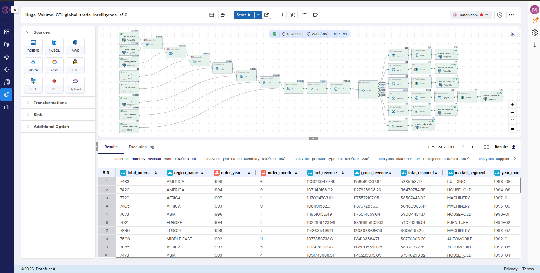
The pipeline that produced these analytics tables reads from the TPC-H scale factor 10 dataset: eight source nodes pulling 60 million line items alongside orders, customers, parts, suppliers, nations, and regions from a PostgreSQL database. DataFuseAI's drag-and-drop canvas assembles the full topology without code.
 Enlarge
 Seven sequential Join nodes assemble the enriched fact table, adding geographic hierarchy, product category, and supplier financial data to every line item. A Derived column node computes net_revenue (l_extendedprice × (1 − l_discount)), order_year, order_month, and part material components at row level — before aggregation. A six-way Route then distributes all rows to six simultaneous aggregation branches, each writing to a separate DataFuseAI analytics sink in the results database.
| Analytics Table | Grain | Rows | Powers These Views |
|---|---|---|---|
| monthly_revenue_trend | year × month × region × segment | 2,100 | Revenue trend, dual-axis line chart |
| geo_nation_summary | nation × segment | 125 | Symbol map, nation bar, region heatmap |
| product_type_kpi | part_type × region | ~750 | Top part types bar, material treemap |
| customer_tier_intelligence | tier × segment × nation | ~500 | Tier distribution, revenue by tier |
| supplier_nation_health | supplier_nation | 25 | Supplier health scorecard |
| order_priority_summary | priority × year | 35 | Order priority pie, year-over-year trend |
The complete pipeline architecture and the Power BI implementation of the same output are documented in the companion guide for Power BI teams. That guide covers the pipeline topology in depth. This post focuses on what the 3,535 rows enable specifically for Tableau — the connection model, the calculated fields, and the visualization mechanics that differ from other BI tools.
Connecting Tableau to Pre-Aggregated PostgreSQL Output
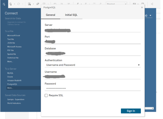
The analytics output lives in a PostgreSQL database. Tableau connects via the native PostgreSQL connector — not Generic ODBC, not Other Databases. The native connector handles data type mapping correctly and produces more efficient queries than the generic fallback.
 Enlarge
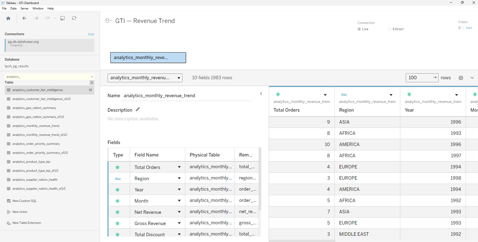
 With the connection established, all six analytics tables appear in the public schema browser. At 3,535 total rows, a Live connection is the right default. It keeps all six dashboards current with every DataFuseAI pipeline run without requiring a separate Extract refresh schedule. Tableau's performance guidance recommends Extract for sources where Live query response exceeds three seconds;[2] the pre-aggregated tables respond in well under one second on every interaction.
 Enlarge
 Three field configurations matter before any worksheet is built. First: order_year and order_month arrive as integer columns, which Tableau classifies as Measures by default. Both must be converted to Dimensions in the data source panel — SUM(order_year) is meaningless as an aggregated measure. Once converted, a MAKEDATE calculated field creates a sortable date value from those integers: MAKEDATE([order_year], [order_month], 1). This field goes on the Columns shelf as a continuous (green pill) date, producing the correct chronological axis for the revenue trend chart. Without it, sorting months requires custom configurations that break when filtered.
Second: nation_name and customer_nation in the geographic tables receive Geographic Role → Country assignments. TPC-H stores nation names in all-caps — CHINA, INDIA, FRANCE, UNITED STATES. Tableau's geocoder resolves most of them; a small number may require manual lookup via Edit Locations for the symbol map to render correctly. One specific case: MIDDLE EAST is not a recognized Tableau geographic entity. The regional analysis treats it as a plain text dimension label rather than a mapped polygon.
Third: customer tier gets a custom sort calculated field. Without it, Tableau sorts Platinum, Gold, Silver, Bronze alphabetically — Bronze, Gold, Platinum, Silver — which inverts the value hierarchy the dashboard communicates. The CASE expression: CASE [customer_tier] WHEN 'Platinum' THEN 1 WHEN 'Gold' THEN 2 WHEN 'Silver' THEN 3 ELSE 4 END.
These three configurations complete the full setup. Everything after this point is visualization work on correctly typed, grain-aligned data.
The Dashboard Suite: Six Views at Scale
With six data sources configured and calculated fields in place, the worksheet library builds directly against pre-aggregated tables. Every chart operates on rows already at their correct analytical grain. Mark counts are low, filter interactions are fast, and the shelf-to-chart translation requires no data modeling workarounds.
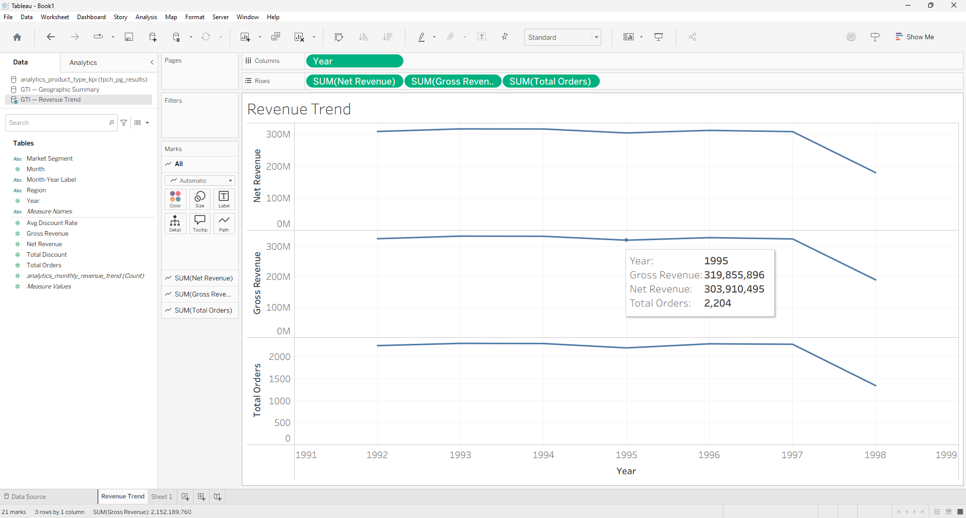
Monthly Revenue Trend
 Enlarge
 MAKEDATE on the Columns shelf as a continuous date places each month correctly on the axis. Net revenue on Rows, gross revenue on a synchronized right-hand axis — dual-axis line chart, five region-colored lines each. DataFuseAI computed net_revenue at line-item level before aggregating to monthly grain; the discount signal is already encoded in the numbers Tableau reads. Mark count: 2,100. Filter response on region or segment: under 200 milliseconds.
Geographic Intelligence
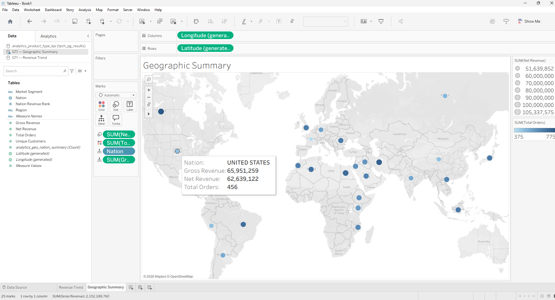
Enlarge The geographic worksheet uses a symbol map — circles positioned by latitude/longitude, sized by net revenue. Twenty-five nations render as 25 marks, each one a single pre-aggregated row. A sorted bar chart ranks nations by total revenue to the right. A 5×5 region-by-segment highlight table at the bottom shows SUM(net_revenue) with color saturation encoding for each combination of world region and market segment — the format Tableau calls a highlight table, using Color on the Marks card against a text table structure.
Geographic teams answer two questions from one screen: which nations outperform their regional weight, and which segments drive revenue within each world region. Filter interactions complete before the user's hand lifts from the mouse — because the underlying table has 125 rows, not 60 million.
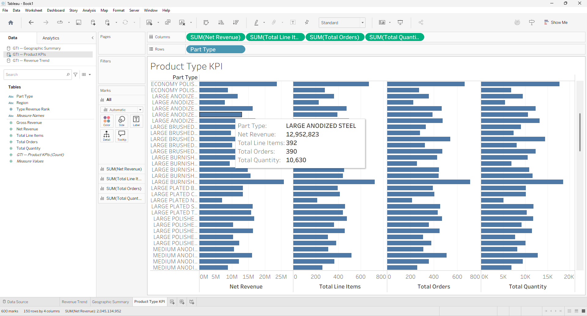
Product Type KPI
 Enlarge
 Part types in TPC-H follow a three-word pattern: {SIZE} {FINISH} {MATERIAL} — for example, ECONOMY ANODIZED STEEL. The DataFuseAI pipeline extracted material, finish, and size as separate columns before aggregation. The Tableau worksheet uses a horizontal bar for top 20 part types (controlled via a parameter slider) and a treemap for material revenue breakdown — five materials, area encoding revenue contribution. No string parsing or SPLIT functions are required in Tableau; the analytical columns arrive clean.
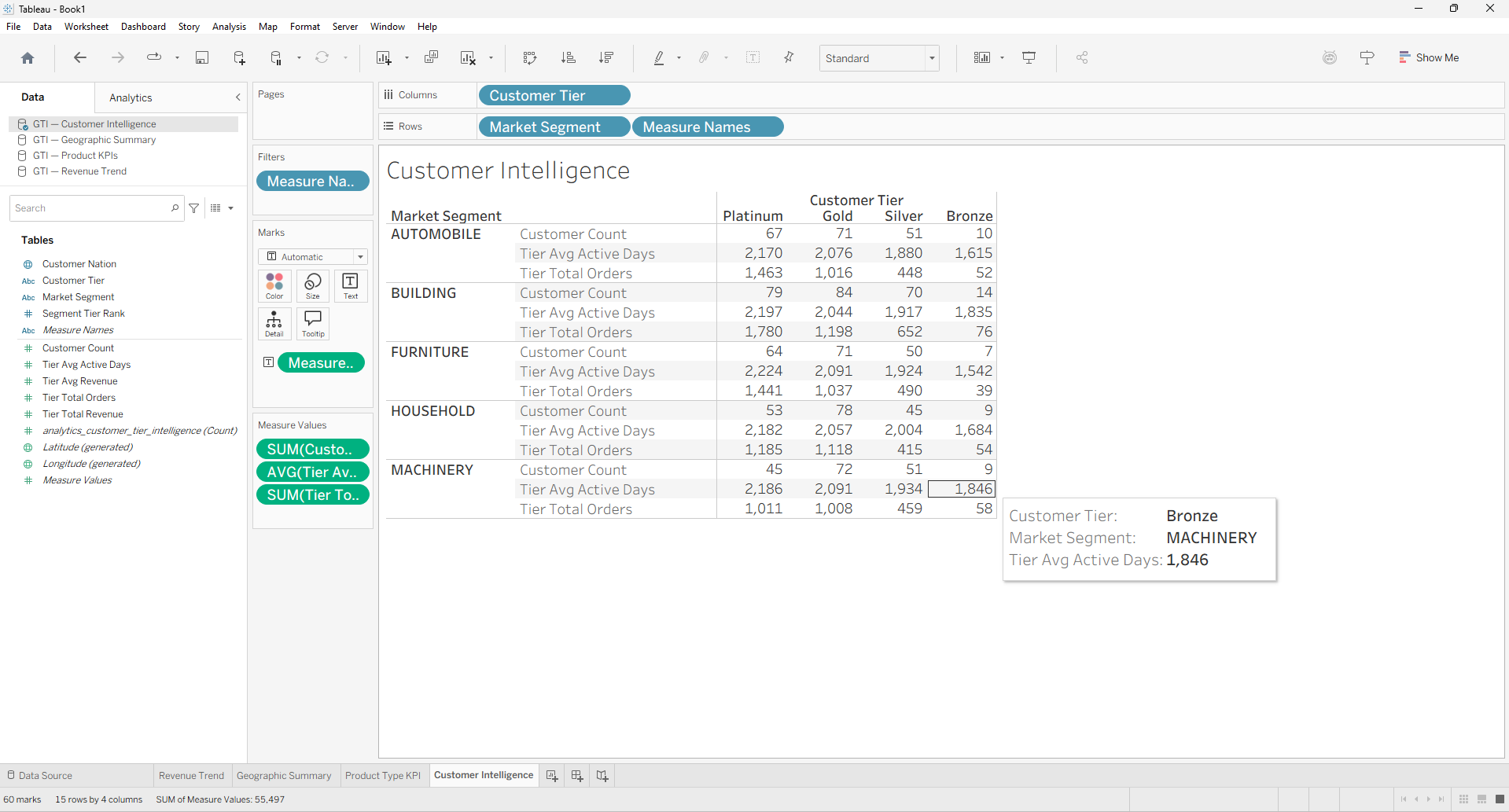
Customer and Tier Intelligence
 Enlarge
 Customer tier distribution shows as a stacked bar across the five market segments — the proportion of customers in each tier per segment. Revenue by tier appears as a grouped comparison bar. The Platinum → Gold → Silver → Bronze sort order, defined by the CASE calculated field, ensures the value hierarchy reads correctly left to right. The ~500-row customer_tier_intelligence table handles cross-filtering to single segments in under a second; switching between Automobile, Building, Furniture, Household, and Machinery segments produces immediate visual response.
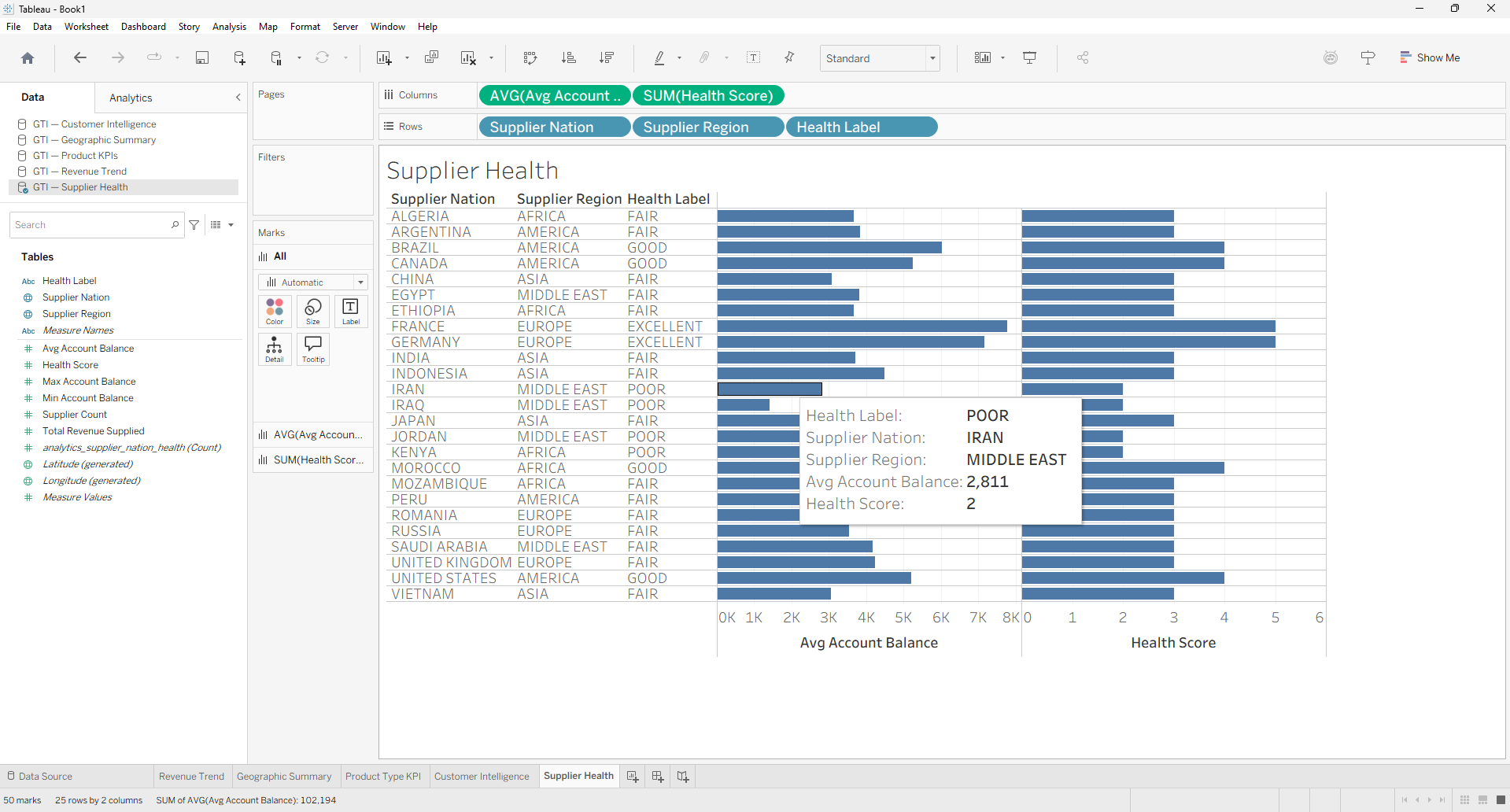
Supplier Health Scorecard
 Enlarge
 Twenty-five supplier nations appear as color-coded bars. Color encodes the five-label health classification — EXCELLENT through AT RISK — mapped to a sequential diverging palette from green to red. Bar length shows average account balance. Negative balances are valid credit positions in the TPC-H supplier model, not data errors; the reference line at zero makes them immediately interpretable. Sorting by average balance descending places the highest-performing nations at the top without requiring a manual sort configuration.
Order Priority Distribution
 Enlarge
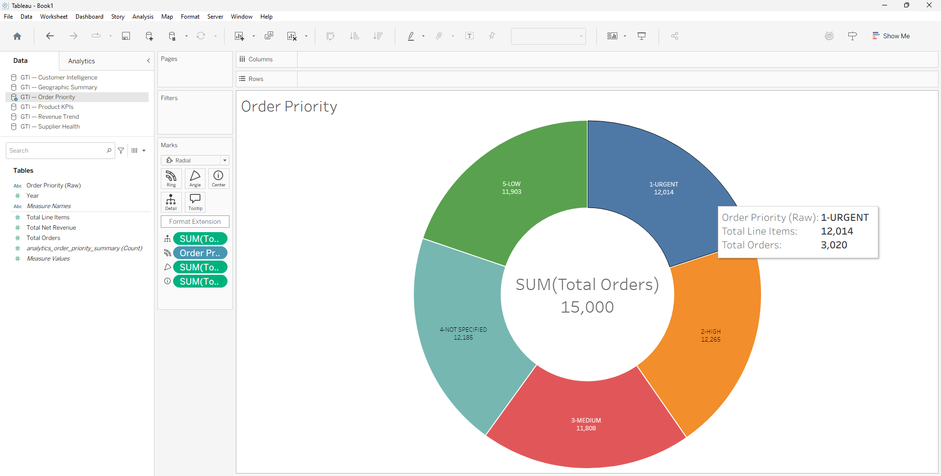
 Order priority uses a pie chart with five slices — one per priority level from 1-URGENT to 5-LOW. Five is the limit where human perception can reliably distinguish angular segments; the chart sits at exactly that threshold. One detail requires a calculated field: the raw order_priority field carries trailing spaces from the pipeline's window aggregation ("2-HIGH "). A TRIM([order_priority]) field produces clean labels before any color encoding or slicer is applied. Without it, filter dropdowns show padded duplicates and chart labels display with inconsistent padding.
Operations teams see seven fiscal years of order priority data without querying a database or running a report. The 35-row order_priority_summary table makes the full temporal view instantaneous — a year-over-year trend that would require a complex analytical query against raw order data answers as a single Tableau view load.
What Pre-Aggregation Removes from the Tableau Workflow
The practical difference between a Tableau workflow on raw relational data and one on DataFuseAI pre-aggregated output isn't fully visible on the finished dashboard. It's visible in what the Tableau author never had to build — and in the debugging sessions that never happened.
The FIXED LOD calculation chain is the most significant item eliminated. Without pre-aggregation, every percentage denominator requires a FIXED expression with deliberate grain management and filter interaction verification. Nation as a percentage of region total, tier as a percentage of segment total, product type as a percentage of regional product revenue — each requires its own FIXED LOD, and each carries the same risk: if the Tableau author doesn't know that FIXED LOD ignores dimension filters at Level 4 of the filter order of operations unless promoted to Context at Level 3, the denominator is wrong in a way that looks plausible. Wrong percentages that pass a visual inspection are the hardest bugs to find.
Fan-out is the second class eliminated. The raw TPC-H schema requires joining seven tables — lineitem, orders, customer, nation (read twice), region, part, and supplier — to assemble the required analytical fields. Physical Joins on one-to-many relationships in Tableau's data source layer can inflate measure values when a join key produces row multiplication. Tableau's Relationship model (introduced in version 2020.2) handles multi-grain tables more gracefully than physical Joins, but configuring it correctly for a seven-table schema with two reads of the same nation table still requires deliberate grain verification at every step. Any measure aggregated from an inflated table produces wrong totals in ways that also pass visual inspection.
With DataFuseAI output, both categories disappear. Six single-table data sources — one per dashboard domain — each contain pre-joined fields at the correct analytical grain. There are no multi-table joins in Tableau's data model to verify. The only FIXED LOD expression needed corrects one specific, documented data characteristic. The Tableau author builds charts.
What the Tableau author still writes: MAKEDATE to construct the continuous date axis from integer year and month columns. A CASE sort expression to order customer tiers by value rather than alphabetically. A TRIM field to clean trailing spaces on order_priority labels. A single FIXED LOD to correct the region revenue denominator. That's the full scope of calculated field work across all six dashboards.
What This Demonstrates About Tableau at Scale
3,535 rows from 60 million source records. Six dashboards. Every filter interaction in under a second from a Live PostgreSQL connection on a standard development machine.
The DataFuseAI pipeline reached 64,439 rows per second at peak throughput on a 2-core 16 GB Databricks cluster — not specialized hardware, just a correctly structured pipeline on appropriate compute. The compression ratio is 99.996%. What Tableau receives is precisely what Tableau is built to work with: clean, grain-aligned, purpose-built analytical tables that the visualization engine can read without aggregation overhead.
The pattern holds for any high-volume operational dataset. Financial ledgers, retail transaction histories, logistics event streams, healthcare encounter records — volume changes, architecture holds. The transformation and aggregation work that converts 60 million rows into 3,535 analytical rows runs once per pipeline cycle. Every Tableau author in the organization benefits on every dashboard open, every filter interaction, every new worksheet build — with no LOD complexity for fundamental metrics, no mark count warnings, and no full-table scans firing in the background.
Pipeline first. Tableau after. The sequence is the result.
Move the Aggregation Upstream. Let Tableau Do What It Does Best.
DataFuseAI compresses tens of millions of operational rows into analytics-ready tables your Tableau team reads directly — no LOD complexity for basics, no mark count warnings, no full-table scans on every filter interaction.
Frequently Asked Questions
For pre-aggregated tables with a few thousand rows, a Live connection performs comparably to an Extract — both return results in under a second at this scale. Live is the better default because it keeps dashboards current with every DataFuseAI pipeline run without requiring a separate extract refresh schedule. Extract becomes worth considering if the database is temporarily unavailable or offline access is required. The performance argument for Extract applies against large raw tables; it largely disappears when the underlying tables are already aggregated to thousands of rows.
Technically, yes. Practically, the consequences are significant. On a Live connection, every filter interaction triggers a full-scan query against 60 million rows — response times measured in seconds per interaction. Converting to Extract shifts the cost: materializing 60 million rows into a .hyper file takes substantial time and storage, and each slicer interaction still queries a large in-memory structure. The deeper issue is that Tableau must request aggregation from the database for every chart render. Pre-aggregation moves that computation upstream to the pipeline, where it runs once and produces rows that Tableau reads directly without further aggregation work at query time.
Three calculated fields cover what the pre-aggregated output doesn't provide directly. MAKEDATE([order_year], [order_month], 1) converts integer year and month columns into a sortable date value for continuous time-series axes. A CASE expression on customer_tier assigns a numeric sort order — Platinum (1), Gold (2), Silver (3), Bronze (4) — so tiers display in value order rather than alphabetical. A FIXED LOD expression on region_name correctly computes region revenue totals for nation-percentage calculations, working around the cumulative running sum stored in the source column. Beyond those three, core metrics arrive as pre-computed columns with no further aggregation expressions required.
Yes. DataFuseAI writes pipeline output to a PostgreSQL database, which Tableau Server and Tableau Cloud connect to via the standard PostgreSQL connector. Publishing follows standard procedure: publish the data source with embedded credentials, then publish the workbook pointing to the published data source. For Tableau Cloud with a private-network PostgreSQL database, Tableau Bridge handles the connection tunneling. The 3,535-row analytics output is compatible with all three DataFuseAI deployment models — Cloud SaaS, Private-Hosted, and On-Premise Offline — since DataFuseAI writes to the configured results database regardless of deployment type.


 Request a Demo